
EDIT: Since I wrote this article, I found a much better alternative to the two suggestion proposed in this article, which is a dependency called tailwindcss-theme-swapper . I might write an article later on about how I have been using it.
I’ve been looking around to find theming solutions online for better color management using Tailwind and couldn’t find a lot, so I’m documenting the solutions I found in this article to help others who are coming across the same problem.
Tailwind only offers support for 2 color theme, most often light and dark. For most use case this is sufficient, but if you’re looking for more options and customization for your project, this might not be enough. Dark theme styles must be defined individually in the html file, making it so every color choice appears twice in the css, which feels redundant, and can become quickly difficult to maintain.
Although the use of CSS variables is possible, it has major downsides: the opacity classes (i.e: bg-primary/50 ) won’t work anymore unless they are defined as ‘raw’ hsl or rgb (i.e: —- color-primary: 0 0 100; ). Besides, using css variables prevents reusing tailwind’s built-in colors, or using your own JSON object for define them.
Here are a couple of solutions I came up with.
Here’s a fairly simple solution that uses just enough abstraction to test out color palettes throughout development, and yet still a nice semantic way to access those colors in code. As a bonus, as opposed to using CSS variables in the tailwind config file, you can see a preview of the color swatch in VScode.
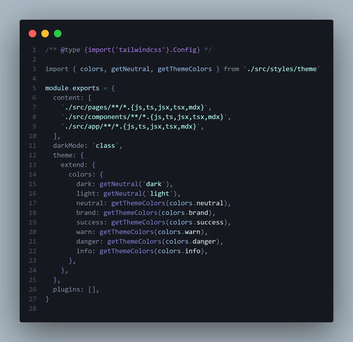
Tailwind Config file:
//tailwind.config.js
/** @type {import('tailwindcss').Config} */

import { colors, getNeutral, getThemeColors } from './src/styles/theme'

module.exports = {
  content: [
    './src/pages/**/*.{js,ts,jsx,tsx,mdx}',
    './src/components/**/*.{js,ts,jsx,tsx,mdx}',
    './src/app/**/*.{js,ts,jsx,tsx,mdx}',
  ],
  darkMode: 'class',
  theme: {
    extend: {
      colors: {
        dark: getNeutral('dark'),
        light: getNeutral('light'),
        neutral: getThemeColors(colors.neutral),
        brand: getThemeColors(colors.brand),
        success: getThemeColors(colors.success),
        warn: getThemeColors(colors.warn),
        danger: getThemeColors(colors.danger),
        info: getThemeColors(colors.info),
      },
    },
  },
  plugins: [],
}
Theme file:
//theme.js
const tailwindColors = require('tailwindcss/colors')

const darkShade = 600
const lightShade = 300
const defaultShade = 500
const neutralLightShade = 50
const neutralDarkShade = 950

export const colors = {
  neutral: tailwindColors.slate,
  brand: tailwindColors.violet,
  success: tailwindColors.teal,
  warn: tailwindColors.orange,
  danger: tailwindColors.red,
  info: tailwindColors.cyan,
}

export const getThemeColors = color => {
  return {
    DEFAULT: color[defaultShade],
    l: color[lightShade],
    d: color[darkShade],
    ...color,
  }
}

export const getNeutral = shade => {
  return shade === 'light' ? neutralLightShade : shade === 'dark' ? neutralDarkShade : colors.neutral[shade]
}
The cons of using this solution are that writing the dark mode, although made slightly more streamlined, is still pretty cumbersome. Also, handling foreground text on top of colored elements is easily doable, but it might be difficult to find a solution that is semantic enough that it makes sense to use it.
This solution is also pretty easy and straightforward, but has a lot of drawbacks that make it difficult for me to commit to. A good version of this solution is provided by shadcn and used in his UI solution (check out his example repo here)
Tailwind config file:
// tailwind.config.js

const { fontFamily } = require("tailwindcss/defaultTheme")

/** @type {import('tailwindcss').Config} */
module.exports = {
  content: [
    "./app/**/*.{ts,tsx}",
    "./components/**/*.{ts,tsx}",
    "./ui/**/*.{ts,tsx}",
    "./content/**/*.{md,mdx}",
  ],
  darkMode: ["class"],
  theme: {
    container: {
      center: true,
      padding: "2rem",
      screens: {
        "2xl": "1400px",
      },
    },
    extend: {
      colors: {
        border: "hsl(var(--border))",
        input: "hsl(var(--input))",
        ring: "hsl(var(--ring))",
        background: "hsl(var(--background))",
        foreground: "hsl(var(--foreground))",
        primary: {
          DEFAULT: "hsl(var(--primary))",
          foreground: "hsl(var(--primary-foreground))",
        },
        secondary: {
          DEFAULT: "hsl(var(--secondary))",
          foreground: "hsl(var(--secondary-foreground))",
        },
        destructive: {
          DEFAULT: "hsl(var(--destructive))",
          foreground: "hsl(var(--destructive-foreground))",
        },
        muted: {
          DEFAULT: "hsl(var(--muted))",
          foreground: "hsl(var(--muted-foreground))",
        },
        accent: {
          DEFAULT: "hsl(var(--accent))",
          foreground: "hsl(var(--accent-foreground))",
        },
        popover: {
          DEFAULT: "hsl(var(--popover))",
          foreground: "hsl(var(--popover-foreground))",
        },
        card: {
          DEFAULT: "hsl(var(--card))",
          foreground: "hsl(var(--card-foreground))",
        },
      },
      borderRadius: {
        lg: `var(--radius)`,
        md: `calc(var(--radius) - 2px)`,
        sm: "calc(var(--radius) - 4px)",
      },
      fontFamily: {
        sans: ["var(--font-sans)", ...fontFamily.sans],
        heading: ["var(--font-heading)", ...fontFamily.sans],
      },
      keyframes: {
        "accordion-down": {
          from: { height: 0 },
          to: { height: "var(--radix-accordion-content-height)" },
        },
        "accordion-up": {
          from: { height: "var(--radix-accordion-content-height)" },
          to: { height: 0 },
        },
      },
      animation: {
        "accordion-down": "accordion-down 0.2s ease-out",
        "accordion-up": "accordion-up 0.2s ease-out",
      },
    },
  },
  plugins: [require("tailwindcss-animate"), require("@tailwindcss/typography")],
}
Global CSS File:
/* global.css */
@tailwind base;
@tailwind components;
@tailwind utilities;

@layer base {
  :root {
    --background: 0 0% 100%;
    --foreground: 222.2 47.4% 11.2%;

    --muted: 210 40% 96.1%;
    --muted-foreground: 215.4 16.3% 46.9%;

    --popover: 0 0% 100%;
    --popover-foreground: 222.2 47.4% 11.2%;

    --border: 214.3 31.8% 91.4%;
    --input: 214.3 31.8% 91.4%;

    --card: 0 0% 100%;
    --card-foreground: 222.2 47.4% 11.2%;

    --primary: 222.2 47.4% 11.2%;
    --primary-foreground: 210 40% 98%;

    --secondary: 210 40% 96.1%;
    --secondary-foreground: 222.2 47.4% 11.2%;

    --accent: 210 40% 96.1%;
    --accent-foreground: 222.2 47.4% 11.2%;

    --destructive: 0 100% 50%;
    --destructive-foreground: 210 40% 98%;

    --ring: 215 20.2% 65.1%;

    --radius: 0.5rem;
  }

  .dark {
    --background: 224 71% 4%;
    --foreground: 213 31% 91%;

    --muted: 223 47% 11%;
    --muted-foreground: 215.4 16.3% 56.9%;

    --accent: 216 34% 17%;
    --accent-foreground: 210 40% 98%;

    --popover: 224 71% 4%;
    --popover-foreground: 215 20.2% 65.1%;

    --border: 216 34% 17%;
    --input: 216 34% 17%;

    --card: 224 71% 4%;
    --card-foreground: 213 31% 91%;

    --primary: 210 40% 98%;
    --primary-foreground: 222.2 47.4% 1.2%;

    --secondary: 222.2 47.4% 11.2%;
    --secondary-foreground: 210 40% 98%;

    --destructive: 0 63% 31%;
    --destructive-foreground: 210 40% 98%;

    --ring: 216 34% 17%;

    --radius: 0.5rem;
  }
}

@layer base {
  * {
    @apply border-border;
  }
  body {
    @apply bg-background text-foreground;
    font-feature-settings: "rlig" 1, "calt" 1;
  }
}
The advantages of using a solution like this one are that, not only the styling will be quicker to write as we don’t need to manage our dark theme with Tailwind, we also can create as many themes as we want based on any class or selector we want.

The big disadvantage is that in order to keep Tailwind’s opacity feature, we need to use the raw rbg or hsl codes, which makes it a lot more difficult to read. Color management is not as easy or intuitive this way, but one solution would be to define semantic color variables at the root, and then use them in the theme:

/* global.css */
@tailwind base;
@tailwind components;
@tailwind utilities;

@layer base {
  :root {

    --gray-hsl--50: 0 0% 100%;
    --gray-hsl--950: 222.2 47.4% 11.2%;

    --background: var(--gray-hsl--50);
    --foreground: var(--gray-hsl--950);

  /* ... */
  }

  .dark {
    --background: var(--gray-hsl--950);
    --foreground: var(--gray-hsl--50);

   /* ... */
  }
}

/* ... */I can think of a couple more options, which I might eventually write down here, but for now, these 2 solutions are the best that I could find for dynamically managing color themes.
